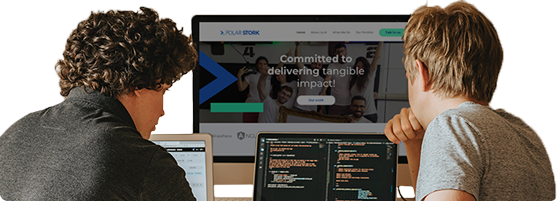
Website Revamp – Bridging Voice
Measured Impact
Page Views
94 % YoY
User Engagement
25 x YoY
Visits to Donation Page
300 % YoY
Business Challenge
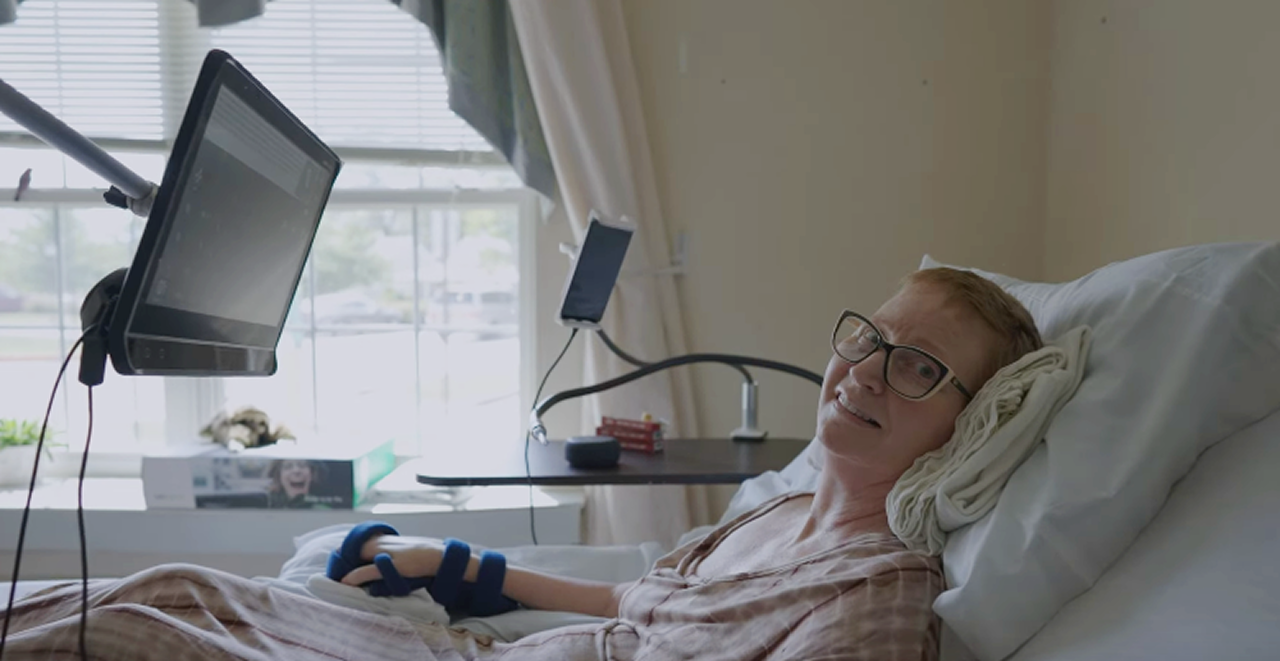
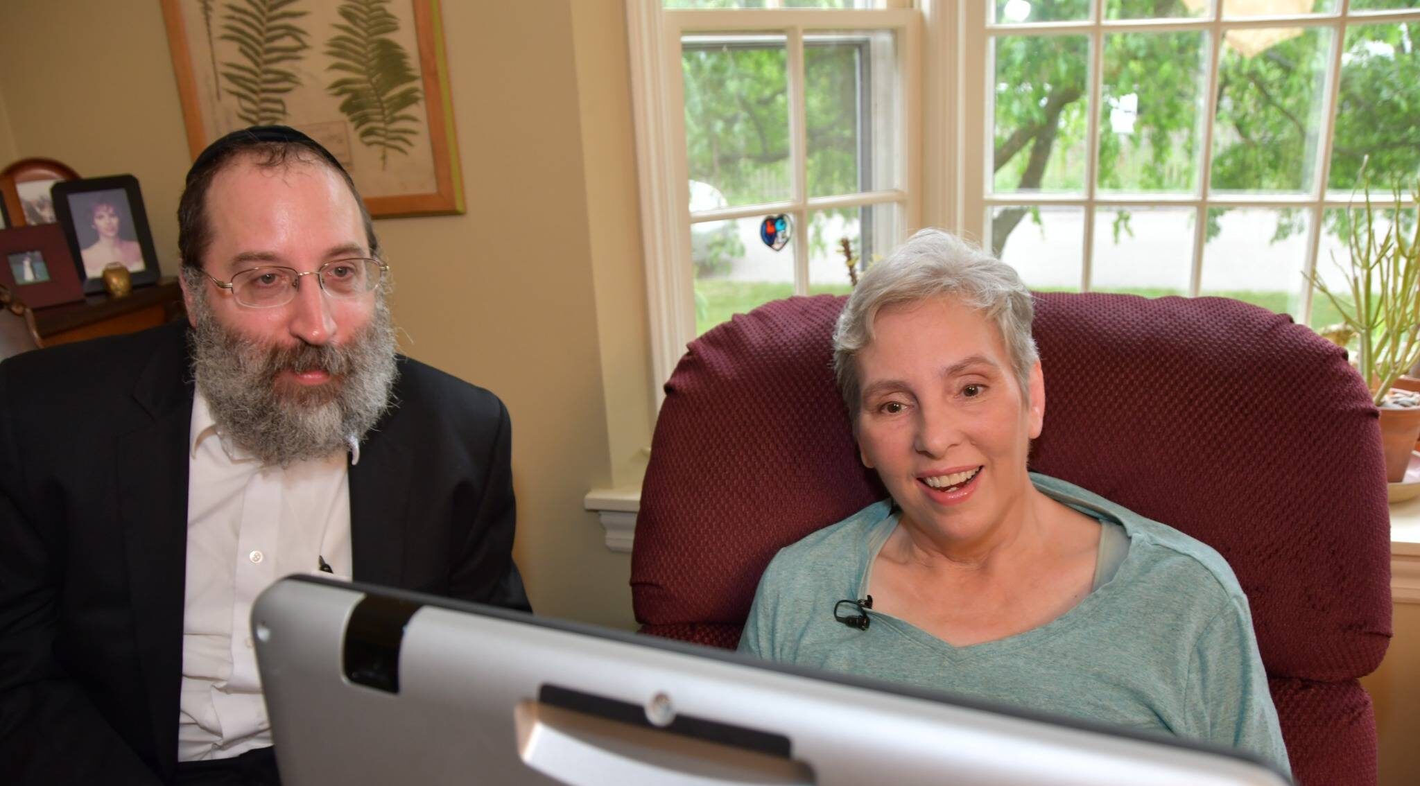
People living with neurodegenerative diseases like ALS, along with their caregivers and healthcare providers, face massive hurdles when trying to access specialized support. Standard websites are often completely unusable for individuals relying on eye-trackers, screen readers, or specialized keyboards, while vital resources remain so scattered that families and practitioners struggle to find life-changing assistive technology. This lack of clear information overwhelmed the Bridging Voice team with a high volume of repetitive support inquiries. Furthermore, an unoptimized donation process failed to highlight the organization's unique mission compared to larger ALS charities, creating friction that made it harder for donors to give.
Impact
The Results
By centralizing and digitizing critical information, the redesigned platform nearly doubled page views with a 94% year-over-year increase, making high-quality resources far more available. The combination of a specialized information architecture and accessible design transformed user engagement, skyrocketing the average active user session by 25 times year-over-year as engagement times jumped from just a couple of seconds to around a full minute. Finally, strategic copywriting and UX optimizations optimized the fundraising pipeline, successfully driving three times more traffic to the donation page.
The Solution
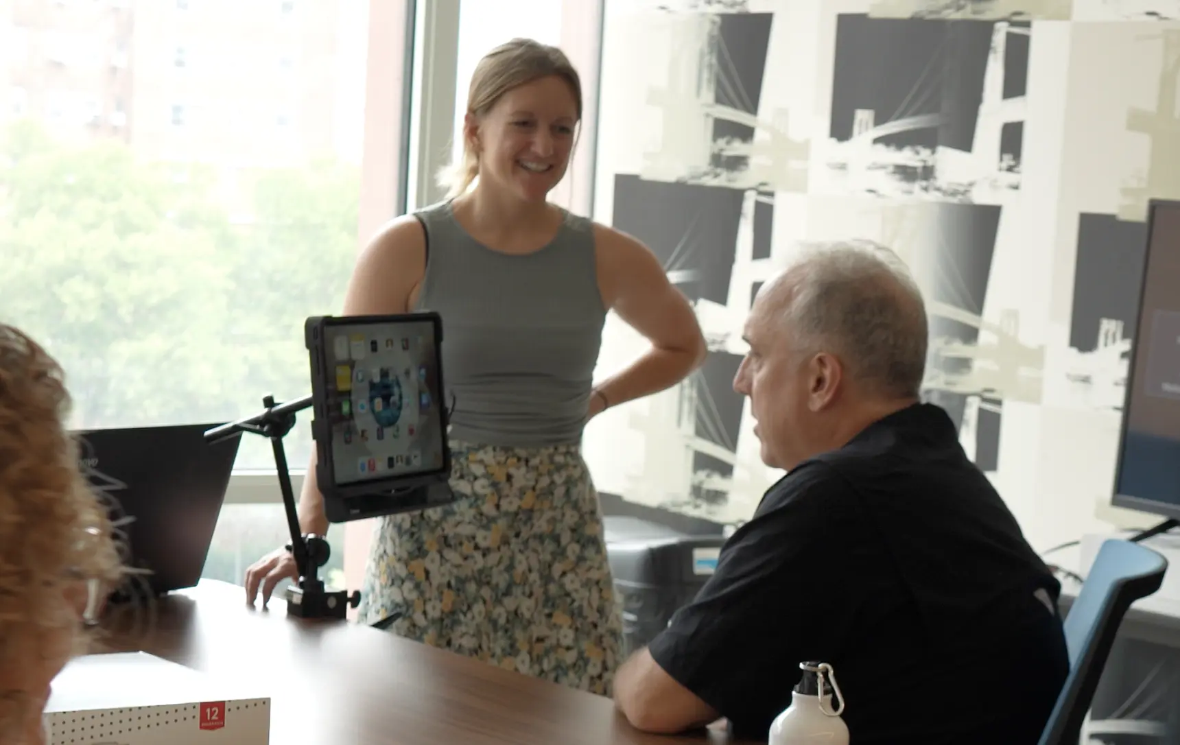
To deliver these results, we mapped out a navigation-first architecture so patients, caregivers, and practitioners can find resources instantly. The interface was reengineered for eye-gaze optimization, using larger elements and strategic spacing to ensure seamless browsing for eye-tracking users. We also shifted to a conversion-first design that drives action rather than passive reading, clearly highlighting the organization's unique mission. Finally, we integrated customized giving pathways with a branded donation form that smoothly accommodates both one-time and recurring contributions.
Key Features Delivered
The Implementation
We utilized our custom "Polar Stork blocks" plugin to build reusable templates, allowing the team to effortlessly maintain visual consistency while having full control over content layouts. By mapping the entire user journey, we designed a strategic information architecture that guides users directly to critical resources, drastically reducing the time from landing to solutions. Donation workflows were integrated into primary user paths, moving calls-to-action out of passive sections and into high-impact, actionable touchpoints. Finally, we configured an advanced analytics layer to track high-value interactions like resource downloads and accessibility feature usage, driving continuous, data-backed improvements.
What did the customer say?

Carly Lynch
Communications Manager
Working with Polar Stork truly felt like working with our own internal team. They took the time to understand our mission and clients, many of whom rely on eye gaze technology, and accessibility was clearly a priority, not an afterthought. They were extremely responsive and thorough, and did a great job helping us find the best long term solutions, rather than just executing on what we thought we wanted. Our new website is flexible, robust, and can grow with our organization. We'd highly recommend Polar Stork to any mission-driven organization looking for a team that truly shows up.